A great logo does more than just look nice — it becomes the face of your brand. It’s the first impression customers have of your business, and it should tell a story, communicate your brand’s values, and set you apart from the competition.
However, getting your logo right isn’t always easy. A poorly designed logo can confuse or even repel your audience, while a cleverly crafted one can make your brand instantly recognizable and memorable.
In this article, we’re exploring the world of logo design with a look at 10 outstanding brand logo examples that hit the mark and tips for how you can ensure your own brand’s logo is successful. We’ll also discuss the impact of digital trends on modern logos. Whether you’re creating a logo from scratch or refreshing an existing one, these insights will help you ensure your logo makes the right statement — every time.
Well-Designed Brand Logo Examples
1. Heineken
![]()
Heineken redesigned the logo by changing the letter font and rotating E letters, making it seem like they’re smiling. Interestingly enough, when Google altered their logo design, they also rotated letter E in the same way.
Why it works: The subtle “smiling” E letters humanize the brand while preserving strong wordmark recognition.
How it scales: The simplified typography performs cleanly across packaging, digital ads, and social media avatars without losing personality.
2. FedEx
![]()
FedEx found a clever way to communicate the core of their business by adding an arrow between the E and the X. The arrow symbolizes the motion of goods being shipped from point A to point B.
Why it works: The hidden arrow reinforces speed and precision without adding visual clutter.
How it scales: Its clean typography ensures clarity on everything from truck wraps to mobile app icons.
3. Tour de France
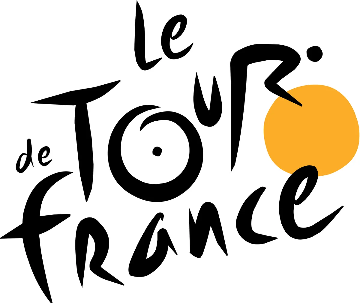
Tour de France subtly incorporated a cyclist in their logo. Letter O, letter U and the orange circle are part of a bicycle, while letter R is shaped like a cyclist. Also, doesn’t the orange circle remind you of warm and sunny France in the summertime?
Why it works: The hidden cyclist transforms typography into storytelling.
How it scales: The bold shapes and limited color palette reproduce well across merchandise, broadcast graphics, and digital platforms.
4. Amazon
![]()
With an arrow going from A to Z, Amazon highlights their great assortment. The arrow is shaped like a smile, associating the brand with positive emotions. The arrow also represents the movement of goods from the warehouse to your doorstep.
Why it works: The A-to-Z arrow communicates breadth and customer satisfaction in one simple gesture.
How it scales: The strong wordmark and standalone arrow icon function seamlessly across packaging, app icons, and global marketplaces.
5. My Indian Closet

My Indian Closet is the epitome of great brand logo examples. It is a simple logo design that manages to communicate the core of the business as well as its cultural heritage.
Why it works: The minimal design reflects cultural identity while remaining modern and approachable.
How it scales: Its simplicity ensures legibility across eCommerce platforms, labels, and social media.
6. NBC
![]()
NBC’s multicolor peacock dates back to the ‘50s when NBC wanted to highlight the network’s color programming. Peacock stands for NBC’s pride (“proud as a peacock”) and the six colors represent the six divisions of NBC. The peacock is facing right, indicating that the company is future-minded.
Why it works: The peacock symbol conveys heritage, pride, and diversity through color.
How it scales: The icon can stand alone for digital applications while the full logo supports broadcast branding.
7. Chad 2010
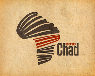
The logo represents a charity mission to the Republic of Chad, a country in north-central Africa. The main goal of the mission was to promote education and buy books for local schools. The logo cleverly incorporates the core elements of the mission, namely the African continent, a child’s face, and books.
Why it works: The layered symbolism communicates mission and geography in a single mark.
How it scales: Its strong shapes maintain impact across campaign materials and digital fundraising channels.
8. Toblerone

Before it was updated in 2022, the Toblerone logo paid a tribute to the confectionery’s birthplace, Bern. If you look closely, you will see a bear in the mountain. The bear has been the symbol of Bern since the 13th century and it is also incorporated in the city’s coat of arms.
Why it works: The hidden bear reinforces heritage without distracting from the primary mountain mark.
How it scales: The bold silhouette remains recognizable across packaging, retail displays, and digital ads.
9. Elettro Domestic

Elettro Domestic, translated as electrical appliances, makes great use of negative space to spell out ED in the shape of an electric plug.
Why it works: The clever use of negative space turns initials into a visual metaphor.
How it scales: The simple plug shape ensures clarity in both print and digital formats.
10. Yoga Australia
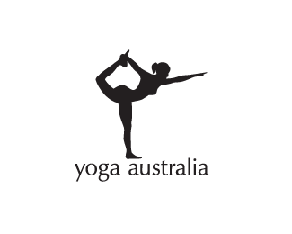
Yoga Australia is another great brand logo example. Notice how the white space formed by the hand and the leg is shaped like Australia.
Why it works: The hidden map of Australia reinforces location through subtle visual storytelling.
How it scales: The clean silhouette adapts well to apparel, digital content, and studio branding.
Avoiding Poorly Designed Logos: Lessons from Real Brand Logo Examples
![]()
Creating a logo that resonates with your audience requires careful thought and a keen understanding of design principles. A poorly designed logo can lead to confusion, unintended interpretations, or even damage to a brand’s reputation. Let’s explore some common mistakes using a few real-world examples and highlight key lessons to help you avoid these pitfalls.
Ensure Proper Spacing and Alignment
One of the most critical errors is the lack of spacing or alignment in a logo’s typography, as seen in the Megaflicks example. Ensuring sufficient spacing between letters is essential to avoid unintended words or shapes that could negatively impact how your brand is perceived.
Choose Colors That Convey the Right Message
Similarly, color choices play a significant role in communicating your brand’s message. The Safe Place logo, for instance, uses colors associated with warning signs, creating an impression that contradicts the brand’s intent.
Avoid Visual Ambiguity
Visual ambiguity is another challenge. In the case of the Institudo de Estudos Orientas and Junior Dance Class logos, both designs failed to consider how the shapes and spaces might be misinterpreted. Logos should be clear and unambiguous, leaving no room for inappropriate or unintended associations.
Focus on Clarity and Intent
Designs like those of Mama’s Baking and The Computer Doctors highlight the importance of clarity and intent. Elements like flames or oddly shaped letters can convey unintended messages that distract from the brand’s core values.
The Risks of Logo Misuse in Large or Regulated Organizations
In large enterprises or regulated industries, logo misuse isn’t just a design issue — it can become a compliance and governance risk.
When teams use outdated logos, stretch proportions, alter colors, or apply unauthorized variations, it can lead to:
-
Brand inconsistency across regions and departments
-
Legal or regulatory exposure (especially in healthcare, finance, and higher education)
-
Erosion of brand trust and recognition
-
Increased production costs due to rework
This is why strong brand governance, clear brand guidelines, and centralized asset management are critical. Ensuring teams always access approved, up-to-date logo files protects both your brand equity and your organization.
Best Practices for Effective Logo Design
-
Keep it simple and scalable
-
Maintain clear spacing and alignment
-
Use colors intentionally
-
Test across digital and print formats
-
Validate with multiple audiences
Keeping these best practices in mind will help you create a logo that effectively represents your brand without risking negative connotations or confusion.
The Role of Digital Trends in Modern Logo Design
These days, logo design is no longer limited to print or static media. It’s crucial for logos to work across a wide range of digital platforms, from websites and social media to apps and even new environments, like augmented and virtual reality. Your logo must be versatile, memorable, and ready for anything the digital age throws its way. To make an impact like these brand logo examples, we have some tips.
Let’s explore some key digital trends that are redefining modern logo design:
1. Minimalism and Flat Design
As mobile browsing continues to dominate, brands are increasingly embracing minimalism and flat design for their logos. The goal is to ensure logos are easily recognizable and load quickly on small screens.
Complex designs with too many details don’t translate well on mobile devices; they can appear cluttered or become unrecognizable when scaled down. Simple, flat designs with bold shapes and clean lines help logos stand out, whether they’re viewed on a desktop or a smartphone.
2. Responsive Logos
Just like websites need to be responsive, logos must also be adaptable. A responsive logo isn’t just a single static image; it’s a set of variations that scale and adjust to different screen sizes, resolutions, and formats.
Think of it as having different outfits for different occasions. For example, a logo might have a simplified version for a small app icon and a more detailed version for a website header. This flexibility ensures your brand remains consistent and recognizable, no matter where it appears.
3. Animated Logos
Static logos can still be powerful, but more brands are now adding movement to their logos through animation. Animated logos are especially effective in digital ads, websites, and social media, where they can capture attention in a fraction of a second.
Whether it’s a subtle movement like a wave or a more complex animation that tells a story, animated logos help brands express their personality and stand out in a crowded digital space. Plus, they’re just more fun!
4. Color Gradients and Variable Color Palettes
Color trends in logo design have shifted from flat colors to vibrant gradients and dynamic color palettes.
Gradients add depth and dimension, making logos visually engaging and modern. Meanwhile, variable color palettes allow logos to adapt their color schemes to different digital contexts, such as dark mode on apps or websites. These techniques create a more dynamic and eye-catching brand presence online.
5. Social Media-Ready Logos
Let’s face it: If your logo doesn’t look good on social media, you’re missing out. Social media is where most people encounter brands for the first time, so logos need to be designed to stand out in crowded feeds.
This often means using bolder colors, simpler shapes, and clear, readable text that can be instantly recognized. Consider how your logo appears as a profile picture, a thumbnail, or even as part of a GIF or meme. Your logo should be versatile enough to handle it all.
Create a Memorable Brand Logo Today With Lytho
A well-designed logo is a powerful tool that captures your brand’s essence and leaves a lasting impression on your audience. By learning from both great and not-so-great examples, and staying aware of evolving digital trends, you can create a logo that truly stands out. Remember, your logo isn’t just a design — it’s the visual heartbeat of your brand.
Ready to create a logo that truly represents your brand? Discover how Lytho’s creative workflow software and digital asset management solutions can help you collaborate on impactful design assets and maintain brand consistency across all platforms.
Schedule a demo with Lytho today to see how our tools can streamline your branding process and elevate your visual identity.
Frequently asked questions
An effective brand logo is simple, memorable, scalable, and aligned with your brand identity. It communicates your company’s values at a glance and remains recognizable across digital and print platforms. Strong logos use clear typography, intentional color choices, and balanced spacing to ensure consistency in every application.
Logo scalability ensures your brand mark remains clear and recognizable at any size — from a social media profile icon to large-format signage. A scalable logo uses clean shapes, limited detail, and responsive variations so it performs consistently across websites, mobile apps, packaging, and digital advertising.
Organizations prevent logo misuse by implementing clear brand guidelines, strong brand governance processes, and centralized digital asset management. Providing approved logo files, usage rules, and version control ensures teams always access the correct assets, protecting brand consistency and reducing compliance risk.